How to make a website landing page that converts Visitors into Customers?
Imagine! a visitor comes to your website through search engines and he jumps quickly! Do you know why it happens? Simple, your landing page is not able to convince and failed to impress them. The alluring landing page always increases the conversation ratio and hence business leads are generated. You can see here 15 amazing ways to create attractive landing pages that increase conversation rate.
Are Interesting, short and uncluttered
Visitor always wants to grab all info about your website in a few seconds. You should clearly mention what they will get from your website. However, the information should be present in a short and interesting way hence it inspires visitors.
Well Arranged Information
It is a very important tip to increase conversation rates. The information should be arranged in well manner on a landing page, which should be clear and crisp. Hence, the visitor can simply understand without surprising. The navigation on the landing page should be obvious, and easy to find. You should not use any strategy, which, disturb the visitor to convert (i.e. pop-ups!).
Clean and Obvious Call-to-action

Eye catching headlines and titles
It is true that numbers of visitors read three-four times headlines of any information. If your headlines are poor and unable to convince the visitors for next actions, you will be failed to convert your visitor! Hence, headlines and titles should always be attractive and effective.
Engage visitors with words
Use live keywords on a landing page which, feel personal touch to a visitor and established a strong image in their mind. Such as ‘you’, this word feels personal to visitors and encourage for conversation.
Awesome Offer on Landing Page

Offer should be Easy to scan at a Quick Glance
The offer you publish on the landing page should be in very easy to read, but it has enough strength that inspired the visitor for next action. In addition, generally, visitors spent 8 seconds to convert; hence, your offer should be trustworthy and able to convince a visitor at a quick glance. You should use effective colors and texts to present your offers.
Relevant and Quality Image
Definitely, the eye-catching image makes the effective landing page and creates a strong impact on visitor’s mind. Add superb image on a landing page which more relevant to your information. You should also put an image with clues that guide the curious visitors what the next, through arrows and buttons.
Easy to Share Button

Gorgeous Design and Classy Act
A lot of people believe that the appearance of a landing page is not enough for a convert. However, it is somewhat true that unique and wonderful design of landing page makes a strong impact in visitors’ mind. If the design of your landing page is poor or ordinary, it may be inspired the visitors to leave your website even though your information is great.
Match the Corresponding ad text
Obviously, your most of visitors come on your website through search engines by clicking specific keyword. That may be your PPC keywords or organic search keyword. When visitors come to your website, they want to grab the most relevant information by keyword. If your landing page not relevant to that keyword or not strongly support the keyword, the visitor may jump from the landing page without any action.
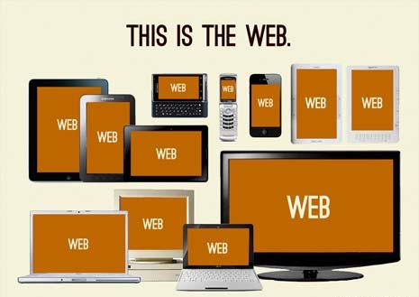
Responsive Design

Follow-up with a Thank You Page

Are fast as a Ferrari
The loading speed of a landing page is quite vital for your website. The visitor doesn’t wait more than few seconds because they have many other options. Your landing page should be displayed in a few moments after clicking otherwise more chances to increase bounce rate. In addition, your all web pages should be loaded faster and catch the visitors until final conversation.
These all fifteen points are quite essential for making landing page effective and attractive.
Request Free Consultation
Amplify your business and take advantage of our expertise & experience to shape the future of your business.


